🔍 Contents
-
Why a well-thought-out KPI dashboard structure matters
-
Chart types and matching KPIs
-
Tips for dashboard design
🎯 Why a Well-Thought-Out KPI Dashboard Structure Matters
A well-designed KPI dashboard supports quick decision-making and targeted process control. Choosing the right chart type and corresponding KPIs is crucial for identifying deviations early and deriving appropriate actions.
🛠️ Chart Types and Matching KPIs
📈 Time Series Chart: Scrap Rate (%)
-
KPI: Scrap Rate
-
Use Case: Quality monitoring over time
-
Chart Type: Line or scatter plot with a target line
-
Required Data: Actual scrap rate values, target value (e.g., 4%)
📸 Screenshot: Scrap rate over time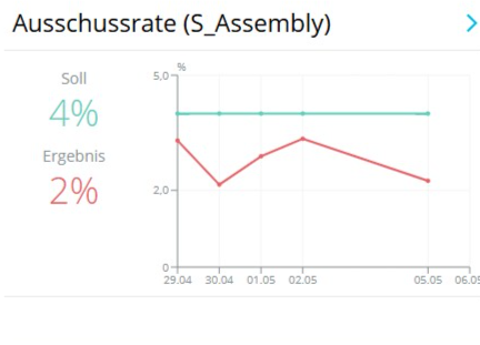
📉 Target Deviation: Open Audit Findings
-
KPI: Open Audit Findings
-
Use Case: Action tracking and audit follow-up
-
Chart Type: Time series with a target line at 0
📸 Screenshot: Audit findings over time
⏱️ Time-Based KPI: Lead Time
-
KPI: Lead Time (in minutes)
-
Use Case: Process optimization and takt time monitoring
-
Chart Type: Line chart with min/max limits
📸 Screenshot: Lead time within target range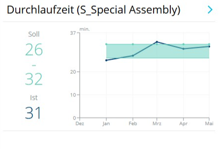
🏗️ Bar Chart with Target Limit: Machine Downtime > 2 h
-
KPI: Machine Downtime
-
Use Case: Analyzing production disruptions
-
Chart Type: Bar chart with a target limit line
📸 Screenshot: Machine downtime with threshold
📊 Multi-Bar: Deviation Overview by Category
-
KPI: Deviations per Category/Month
-
Use Case: Identifying recurring root causes
-
Chart Type: Multi-bar per month
📸 Screenshot: Deviation overview with category bars
📅 Stacked Bars: Workforce Planning
-
KPI: Workforce Planning
-
Use Case: Visualizing workforce coverage needs
-
Chart Type: Stacked bars with traffic light colors
📸 Screenshot: Stacked workforce coverage
🚦 Traffic Light Logic: Production Target Achievement
-
KPI: Production Quantity
-
Use Case: Tracking production goals
-
Chart Type: Bar chart with color logic and target line
📸 Screenshot: Target achievement with traffic light
📚 Cumulative Flow Diagram (CFD): Project Status
-
KPI: CFD (Multi-Project Board – S_PMO)
-
Use Case: Identifying project inventory and bottlenecks
-
Chart Type: Cumulative area/stacked chart
📸 Screenshot: CFD with project status colors
✨ Tips & Best Practices
-
Use traffic light logic specifically to highlight critical KPIs.
-
Avoid too many different chart types in one dashboard – this helps maintain clarity.
-
Use KPI dashboards differently for operational and strategic control (e.g., shop floor vs. management board).